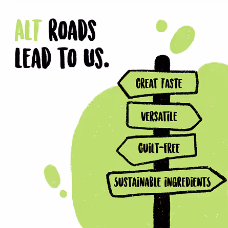
Alt Foods (now rebranded as Better Bet) is a vegan milk brand that believes in being conscious without being preachy, disruptive without being intimidating, and inclusive above all else. It isn’t here to force a switch, but to invite people to try something new and to give vegan a chance. We worked on the first round of packaging, creating an identity that could carry this balance: bold enough to grab attention, playful enough to feel approachable, and distinct enough to break away from the clichés that surround vegan products.
Much like Thursday itself, we thrive in the sweet spot between structure and spontaneity, where wild ideas make love to meticulous execution.
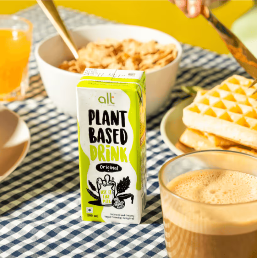
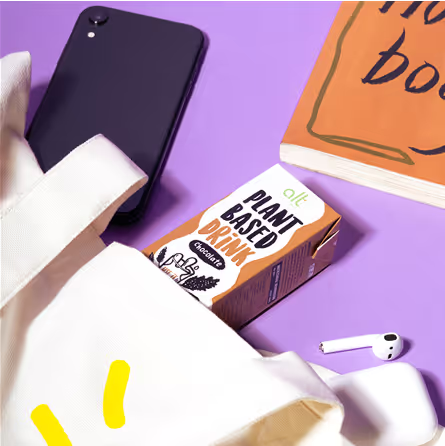
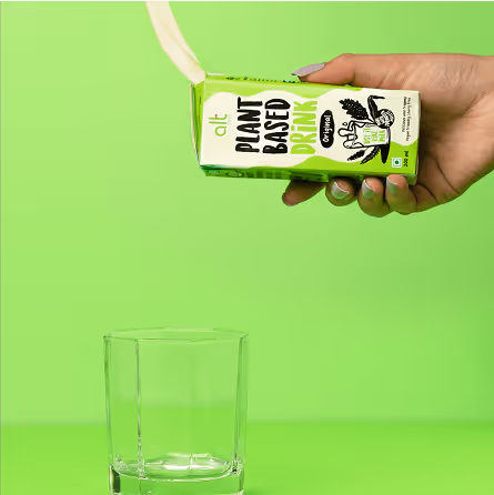
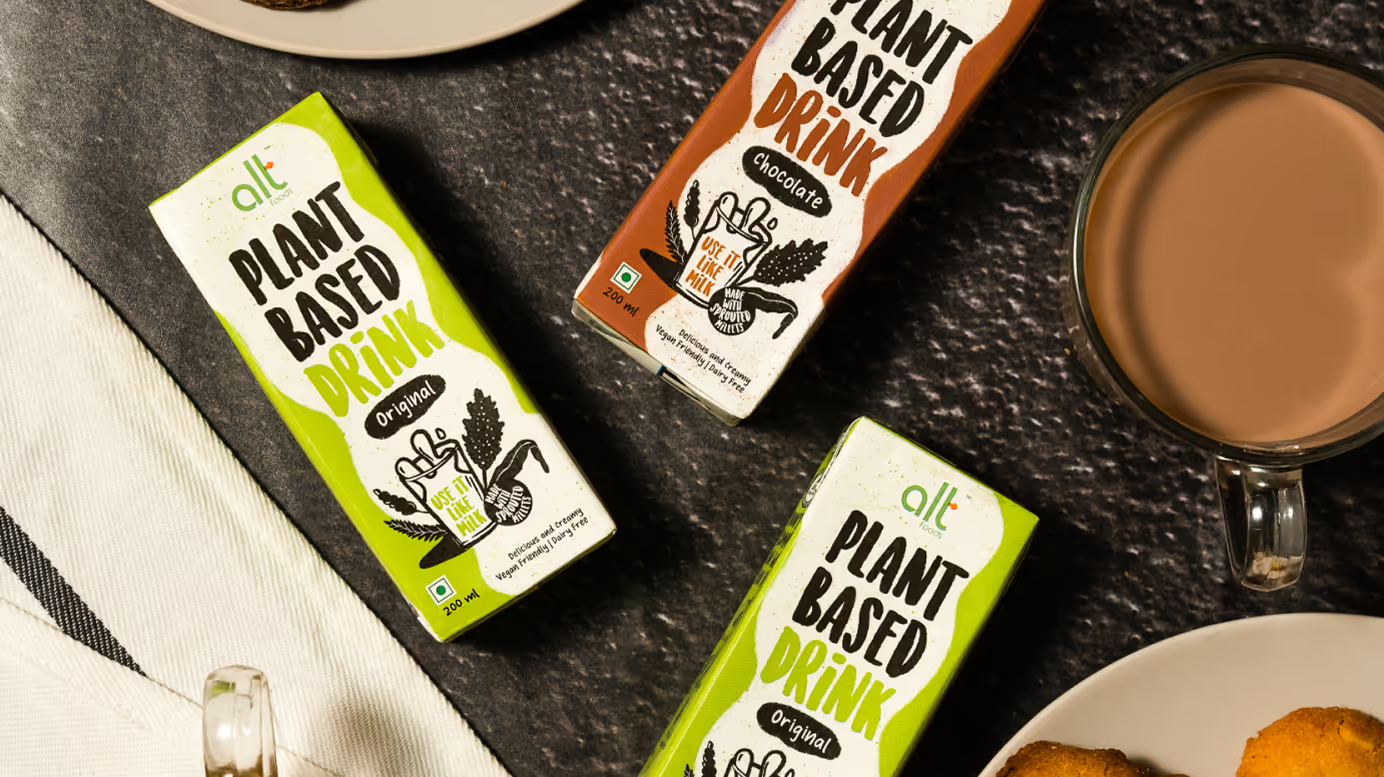
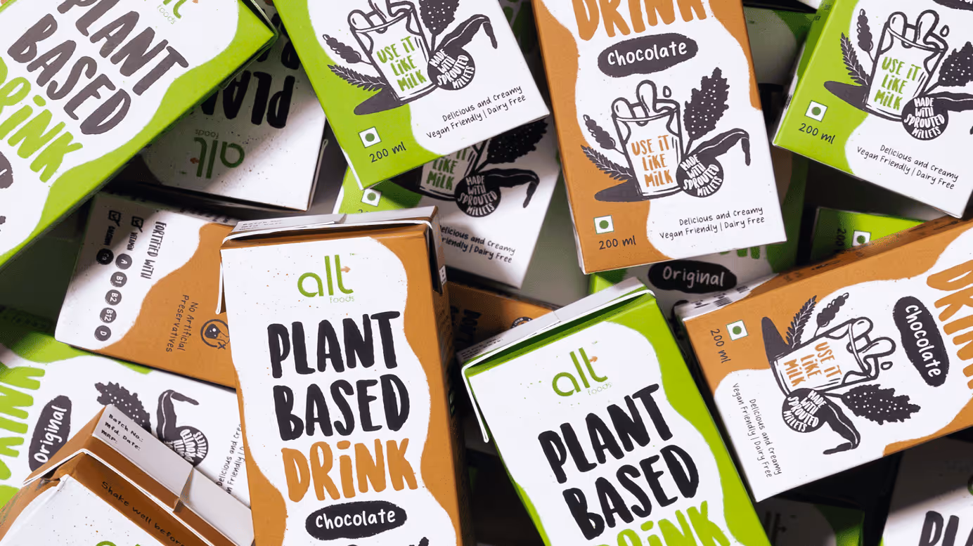
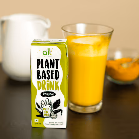
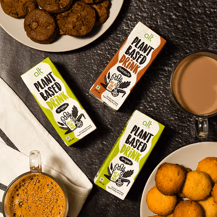
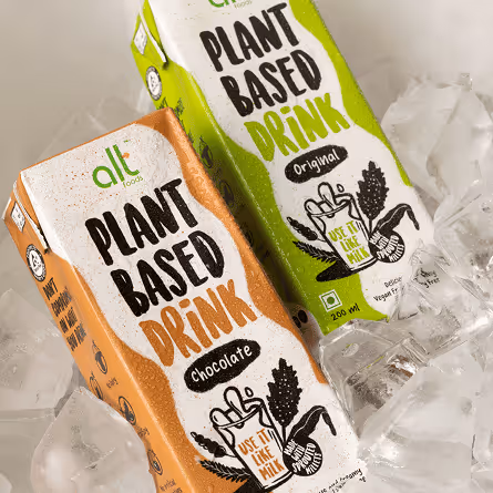
The packaging moves away from the muted, minimal look common in the vegan industry. It uses playful colours and strong typography to create a bold presence that immediately stands out.
This system makes flavours instantly identifiable while keeping the overall identity cohesive.
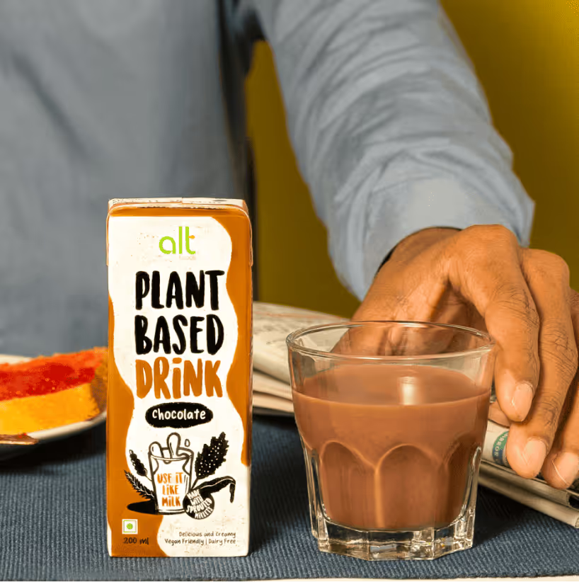
The packaging was designed to be easily expandable across flavour ranges, with each variant distinguished through a bold, dedicated colour.
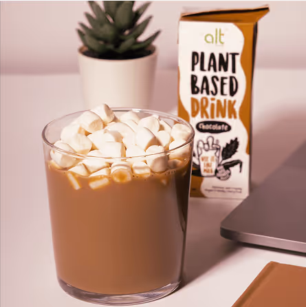
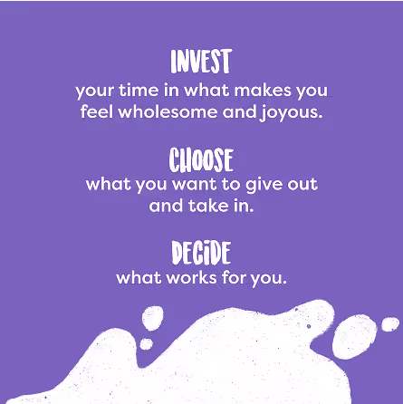
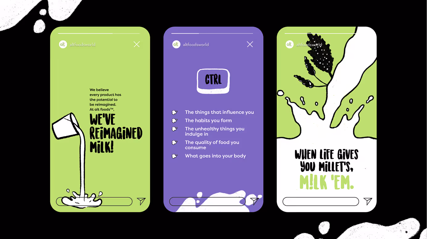
Alt’s digital identity carries the same hand-drawn, raw energy as its packaging - vibrant colours, playful type, and dynamic layouts that grab attention while keeping things approachable and natural.
The tone stays warm and friendly, speaking like a friend rather than a brand. The mix of hand-drawn, raw, and playful visuals with lighthearted, conversational copy makes the feed feel natural, unserious, and easy to connect with.
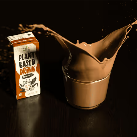
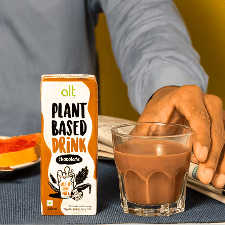
To extend the communication, we created a YouTube video that put the message out through content - give alternate milk a chance. The film showed how Alt fits seamlessly into everyday life, reinforcing one simple idea: use it as milk.
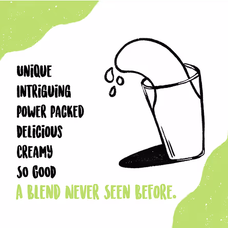
Through animation, we brought Alt’s fun and playful side to life by using hand drawn and raw design elements to make the message engaging and memorable.