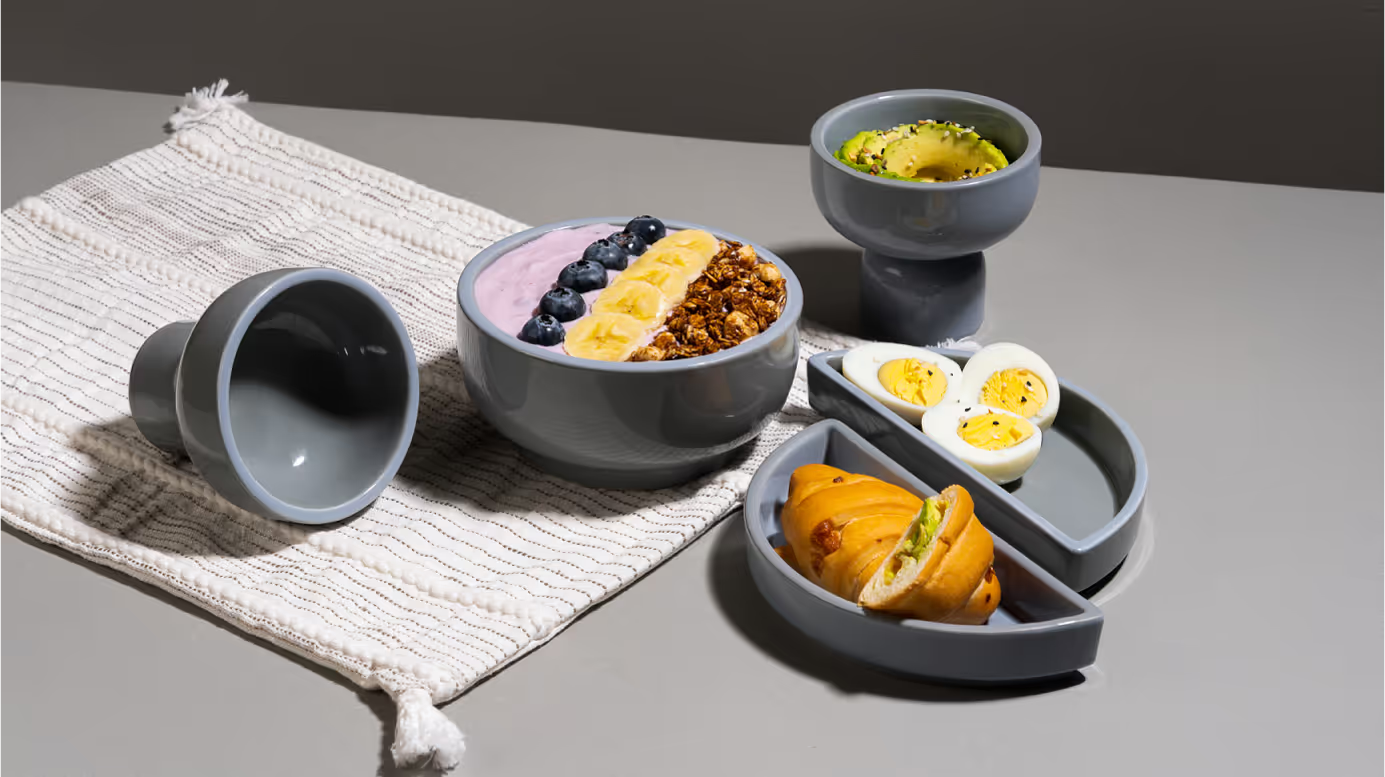
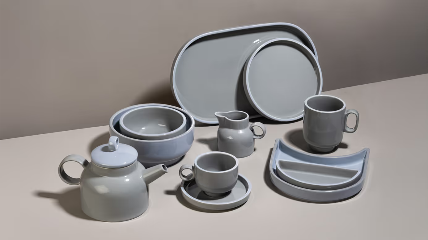
Rena’s new hostware collection, Dine with Grey was inspired by the contrast in Scandinavian - its weather and the warmth found indoors. Scandinavian design became the base - modern, sleek, functional, and crafted with precision. Each product was designed to carry comfort and warmth through its rounded forms and flat edges.
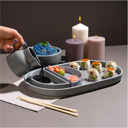
Our Approach
We wanted to translate the comfort of gray into a collection that felt calm, versatile, and timeless. Grey was the anchor, representing balance - neither too light nor too dark, just perfectly comfortable. From this idea, three moods were created: Still with Grey, Rise with Grey, and Explore with Grey, each brought to life through illustration, colour, and product styling.
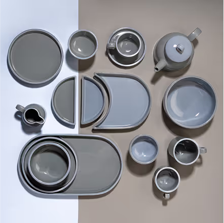
The palette revolved around cool grays, drawn directly from the products themselves. Soft tints of blue were added to enhance the calming, soothing feel. Together, these tones created a modern yet cozy atmosphere. Typography leaned into modern simplicity with subtle curves. It was clean, minimal, and easy to read. The style carried warmth without losing structure.
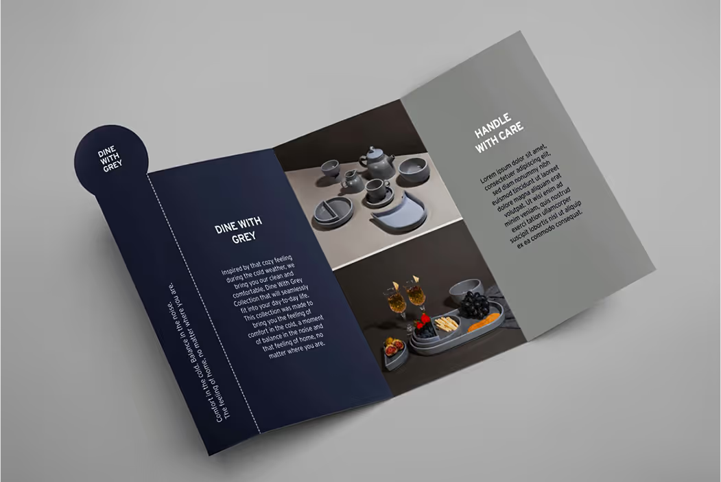
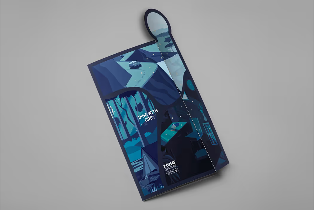
Each mood in the collection was paired with a custom illustration. The visuals captured the essence of stillness, balance, and exploration in simple, minimal strokes. This gave the collection personality while keeping it aligned with Scandinavian design sensibilities. The products were given names like Goblet, Cozy Cup, Snug Pot, Crescent, Moonset, Loop, and Pourer - each simple, evocative, and tied to the collection’s calming and functional spirit.

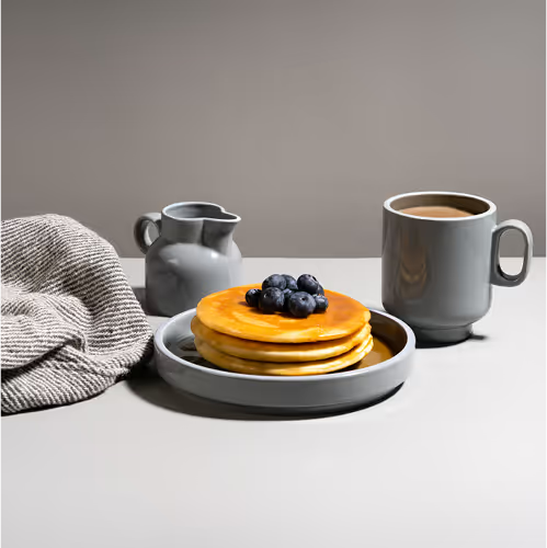
How you begin the day sets its tone. Rise with Grey was about finding balance - whether in a calm breakfast or a quick moment with a hot cup. Grey became the anchor for starting the day with ease and steadiness.

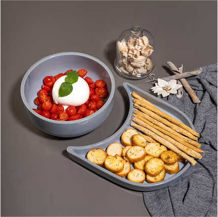
Explore with Grey was about stepping out of the comfort zone while carrying warmth along. It celebrated adventure and new experiences without letting go of the feeling of home. Grey offered the grounding thread that made exploration feel safe and cozy.

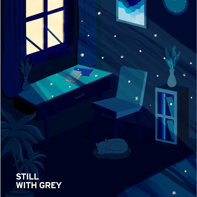
In a noisy world, Still with Grey invited moments of pause. It was about stepping back, enjoying a quiet cup, and embracing solitude. Designed for calm, it encouraged consumers to find stillness in small rituals.
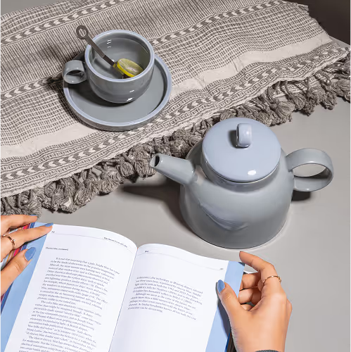
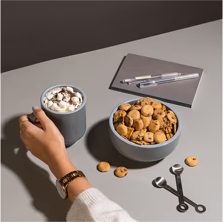
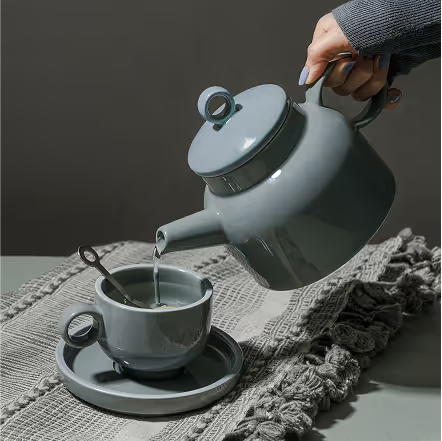
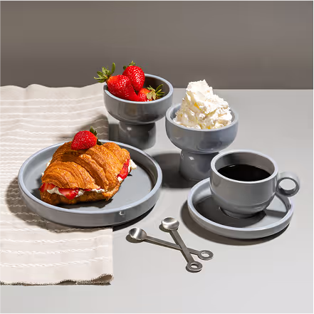
Social assets extended the identity into digital storytelling. Each mood was introduced with its dedicated illustration, paired with the products styled in their respective contexts. The consistency in colors, forms, and tone built immediate recognition for the collection.
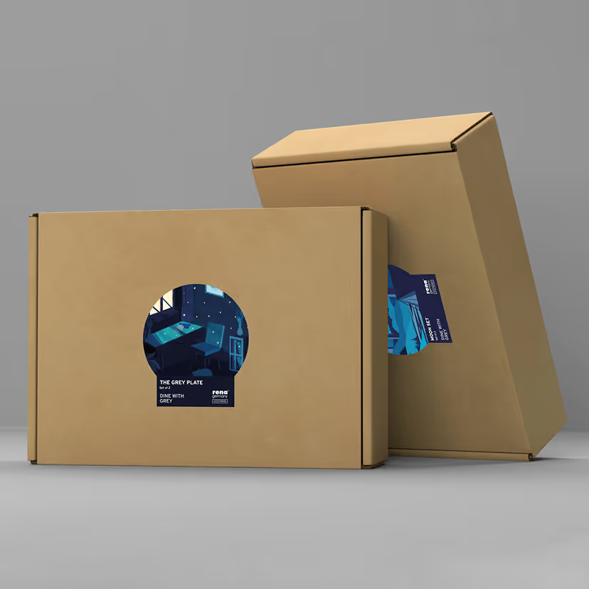
Packaging carried forward the palette of greys and blues with clean, functional layouts. Each product box featured its mood illustration, creating a strong visual identity. The design stayed minimal yet comforting, mirroring the collection’s Scandinavian inspiration.
