Navipoint Health is a forward‑thinking health and wellness brand built around a simple belief: prevention is better than cure. By combining DNA and gut microbiome science, the brand helps people understand what’s happening inside their bodies—and what to do about it. Rather than offering isolated diagnostics, Navipoint Health is designed as a long‑term companion, guiding users through a personalized journey toward better health.
The Challenge
Navipoint Health faced a perception and engagement gap that limited both user adoption and long‑term value.
Our Approach
Our goal was to shift Navipoint Health from a transactional experience to a continuous, personalized lifestyle companion. We focused on clearly communicating long‑term value, simplifying complex science, and building trust through a digital experience that felt human, calm, and credible. By introducing a centralized portal, we created space for ongoing interaction, where users could track progress, revisit insights, and receive evolving recommendations. This reframed health as a journey, not a single moment of diagnosis.
Discovery
Discovery Session
Competitive Analysis
Audience Definition
Strategy
User Experience
Wireframing
Content Writing
Design
Design Strategy
UI Design
Design System
Technology
Quality Assurance
Interactive Prototyping
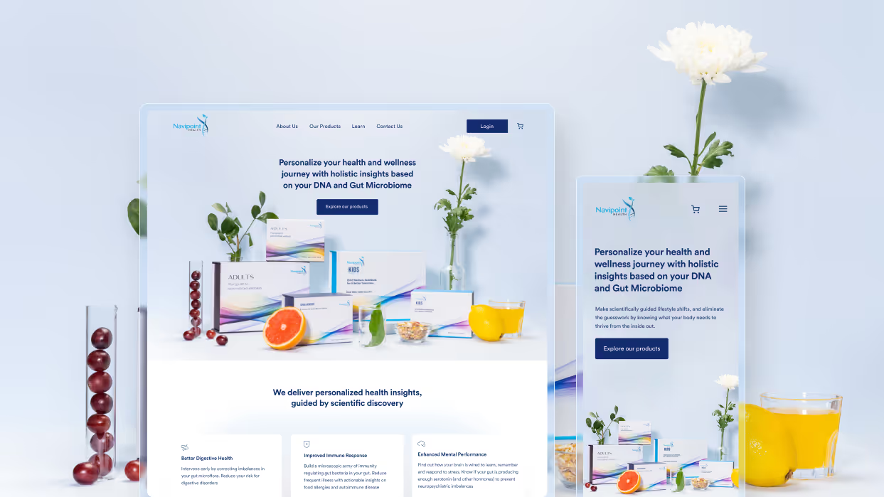
The design language was carefully crafted to balance scientific credibility with emotional approachability, so users felt informed, not intimidated.
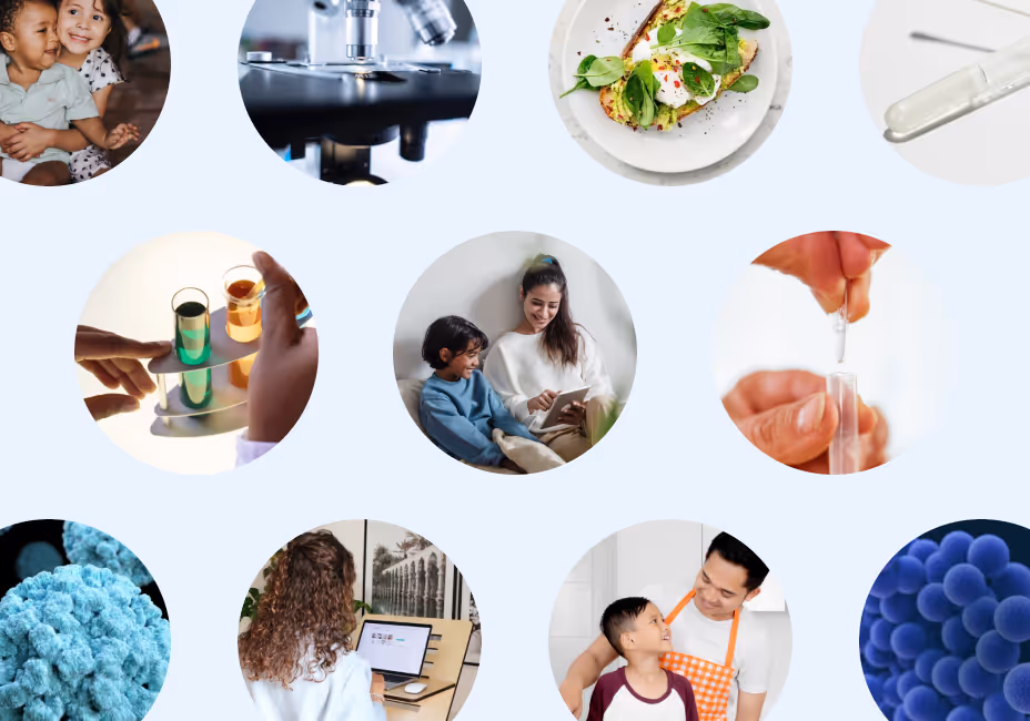
Imagery was intentionally soft and human‑centered. Instead of stark or clinical visuals, we used gentle, abstract representations of science that feel approachable while still reinforcing Navipoint Health’s data‑driven foundation.
Circular Std, a rounded yet serious typeface, was chosen to balance trust and warmth. A mature blue color palette anchors the experience in credibility, while softer supporting tones add approachability. All graphic assets were designed as part of a cohesive system to ensure consistency across the platform.
Iconography draws inspiration from atomic structures, subtly referencing the science behind the product. Icons are minimal and friendly, helping break down complex information while unifying the visual language.
Subtle gradients were introduced to soften the interface and create depth without distraction. They help guide the eye, ease transitions between sections, and support a calm, reassuring visual flow.
Brand narrative
Navipoint Health shifts healthcare from reaction to prevention, using human‑centered design to turn advanced science into a lifelong health journey.
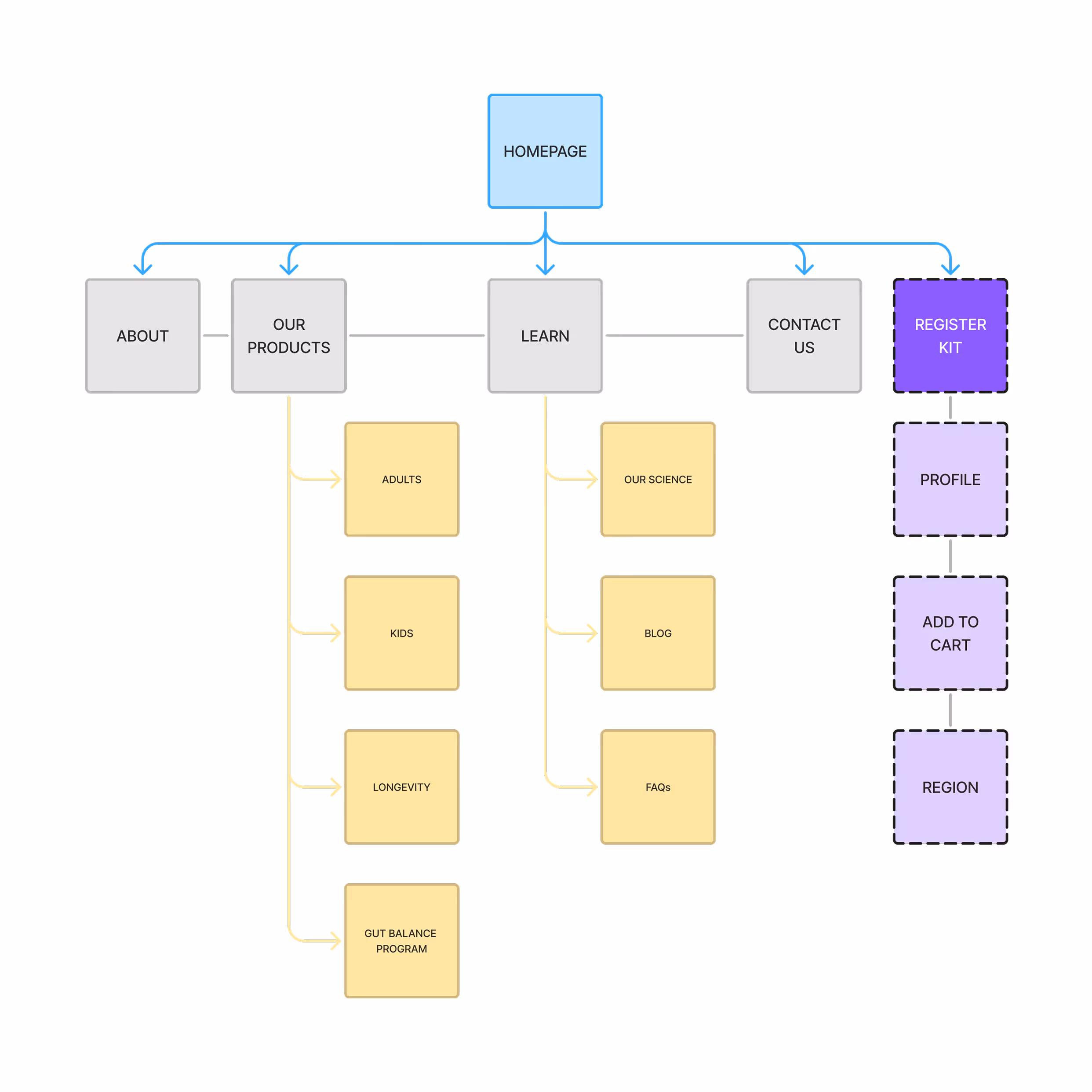
The sitemap was designed to guide users from understanding to action, reinforcing Navipoint Health’s positioning as a long‑term wellness partner rather than a one‑time test. The homepage acts as a central hub, directing users toward learning, exploration, or conversion. Sections like About and Learn build trust early by clearly explaining the science, outcomes, and value. Subsections such as Our Science, Blog, and FAQs reduce intimidation, address concerns, and set clear expectations before purchase. The purchase flow (Register Kit → Profile → Add to Cart → Region) is intentionally separated to keep conversions focused and friction‑free, while Contact Us remains easily accessible to reinforce transparency and support.
The design consistently balances education and reassurance, encouraging exploration without overwhelming the user. By placing DNA and Gut Microbiome insights side by side, the layout communicates Navipoint Health’s core belief in treating the body as a whole—reinforcing a holistic approach rather than isolated testing.
Personalization is further emphasized through relatable, real‑world examples that show how different individuals respond differently to the same inputs, reinforcing that health recommendations should never be generic.
The Kids experience is structured to guide parents from trust to understanding to action. It begins with a clear, value‑led introduction explaining why personalized health matters for children, followed by benefit‑driven sections addressing common parental concerns. Complex science is broken down into what’s included, key features, and personalized insights, while a clear How It Works section sets expectations and reduces hesitation. Repeated CTAs support conversion without pressure.
The e‑commerce sections for Navipoint Health Kids and Adults clearly present each kit, guiding users from understanding to action. Both begin with concise headlines and descriptions, followed by kit contents displayed with icons and bullets for easy scanning, then highlight key benefits. Product imagery reinforces credibility, playful props for Kids and more refined elements for Adults, while safety notes build trust. A bold “I’m Interested” CTA paired with HSA/FSA savings information sits close to the benefits, encouraging conversion without overwhelming the user.
The Our Science page is designed to build trust by making complex research approachable and easy to understand. It breaks down DNA and gut microbiome science into clear, digestible sections that explain not just what the science is, but why it matters.
The dashboard acts as the central hub of the Navipoint Health experience. It brings together personalized DNA and gut microbiome insights in a clear, digestible format, supported by visual summaries, progress tracking, and actionable recommendations, encouraging ongoing engagement and long‑term behavior change.