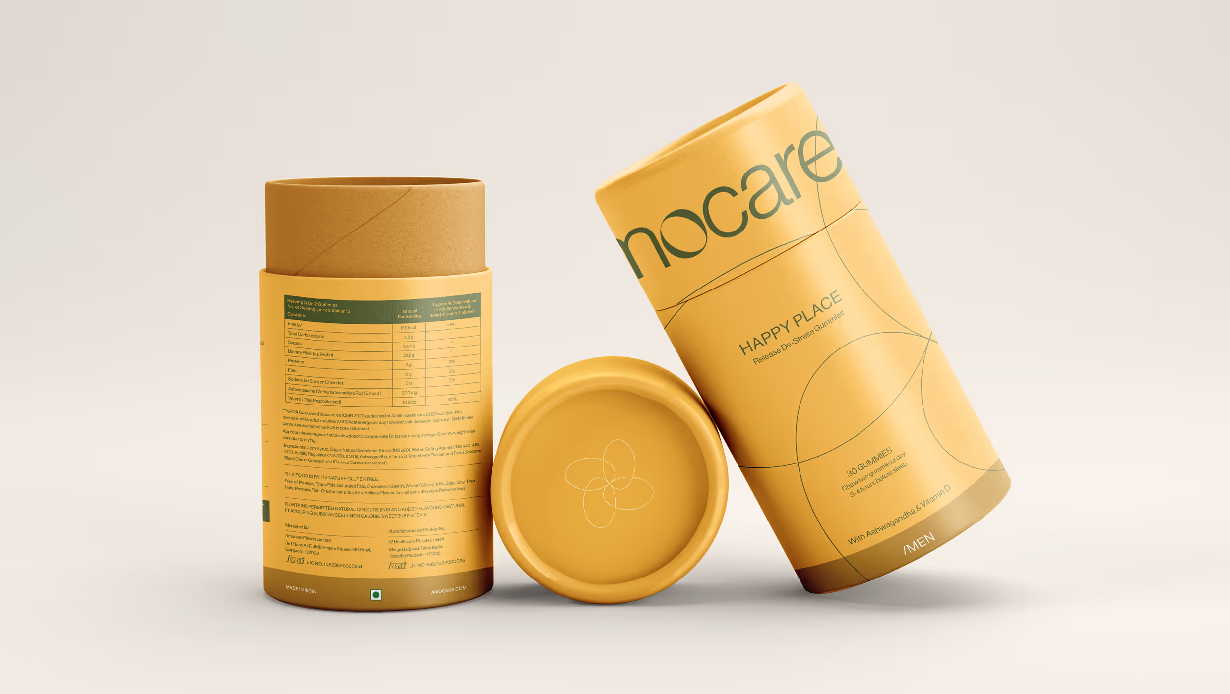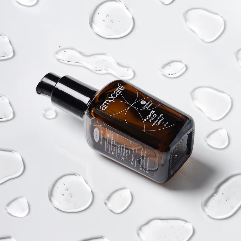
Amocare is a sexual health and wellness brand designed to nurture intimacy and connection in relationships. Rather than focusing solely on the act, Amocare approaches sexual wellness as a journey - one that blends emotional closeness with physical pleasure. With a range of products including gummies, serums, washes, and boosters, the brand invites couples of all ages to rekindle their spark and sustain meaningful intimacy.
The oval form inside the letter 'O' symbolizes the brand’s four foundational pillars: Release, Revitalise, Rejuvenate, and Realise - all working together to support well-being through every stage of intimacy.

The Amocare logo evokes softness and calm, mirroring the inner peace that comes from being in sync with your body and your partner.


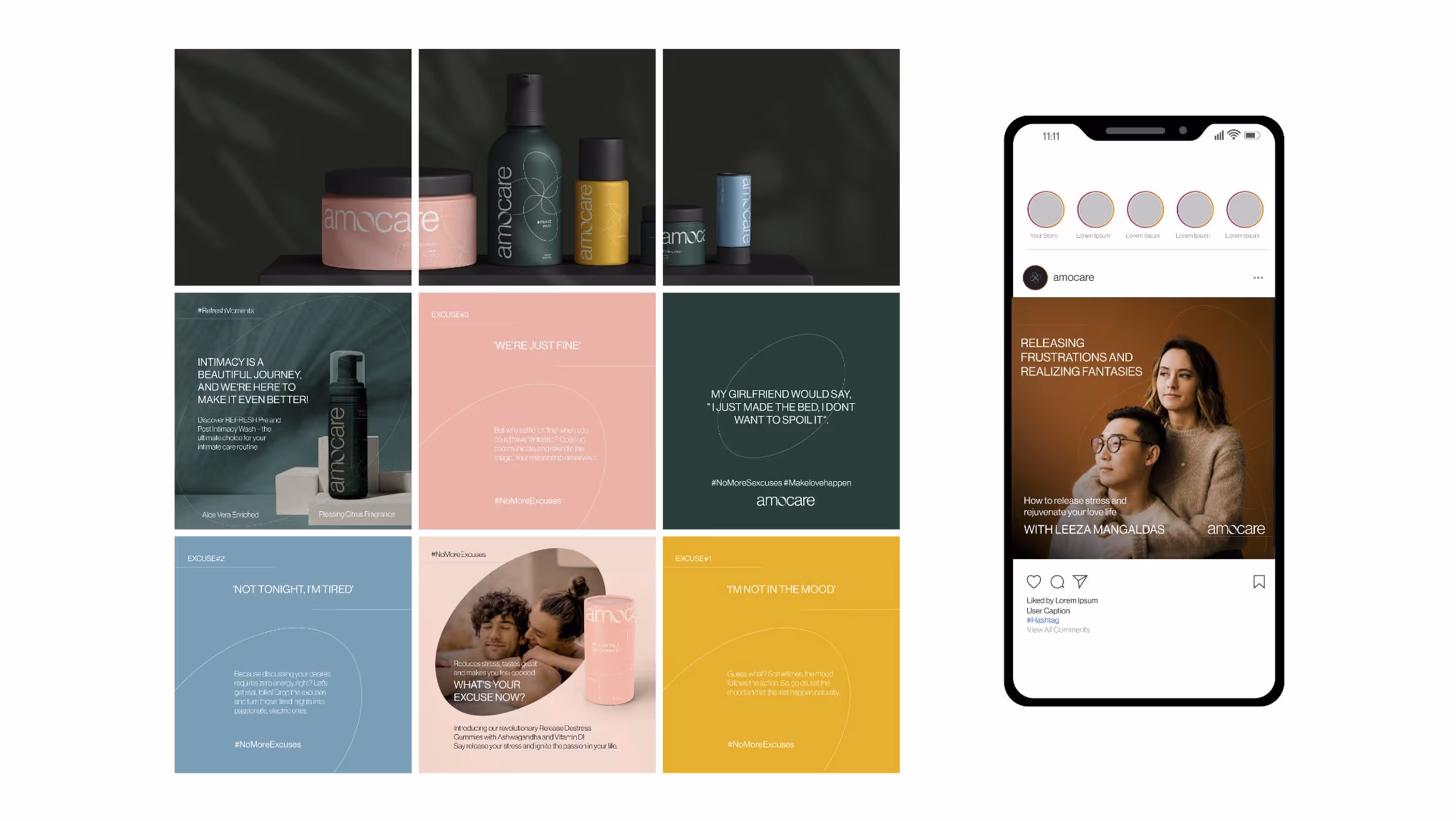
Each colour captures the mood of its pillar, creating a visual system that feels both meaningful and easy to use.
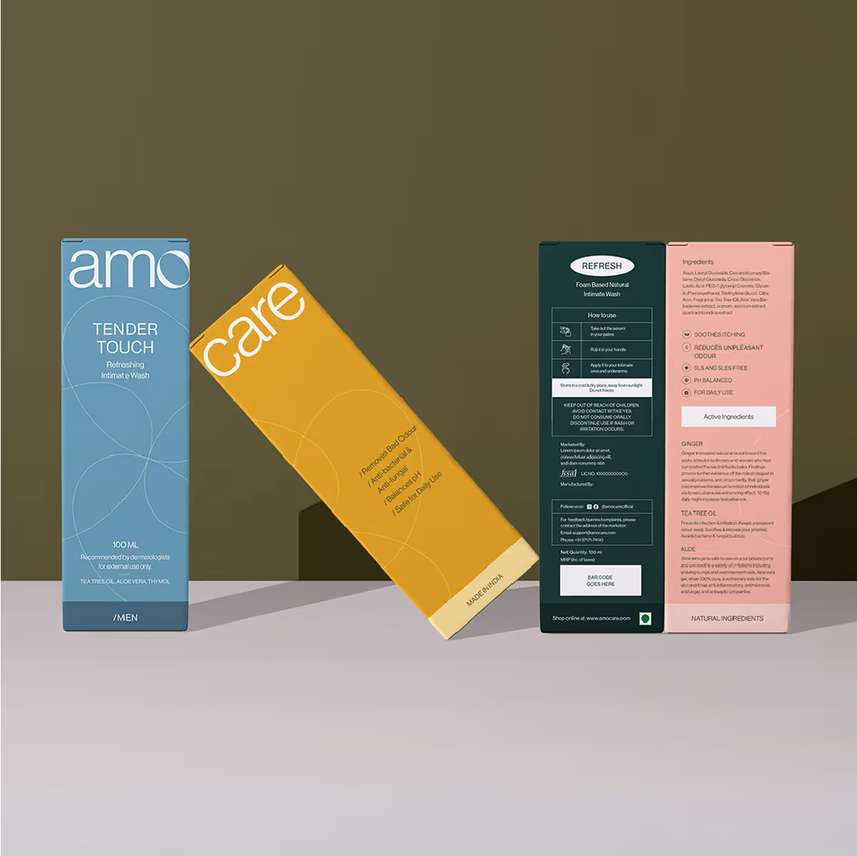
Each product range aligns with one of the brand’s four pillars, represented through a distinct colour for easy recognition and resonance.
Clean, modern layouts paired with compositions creating a sense of calm and trust.