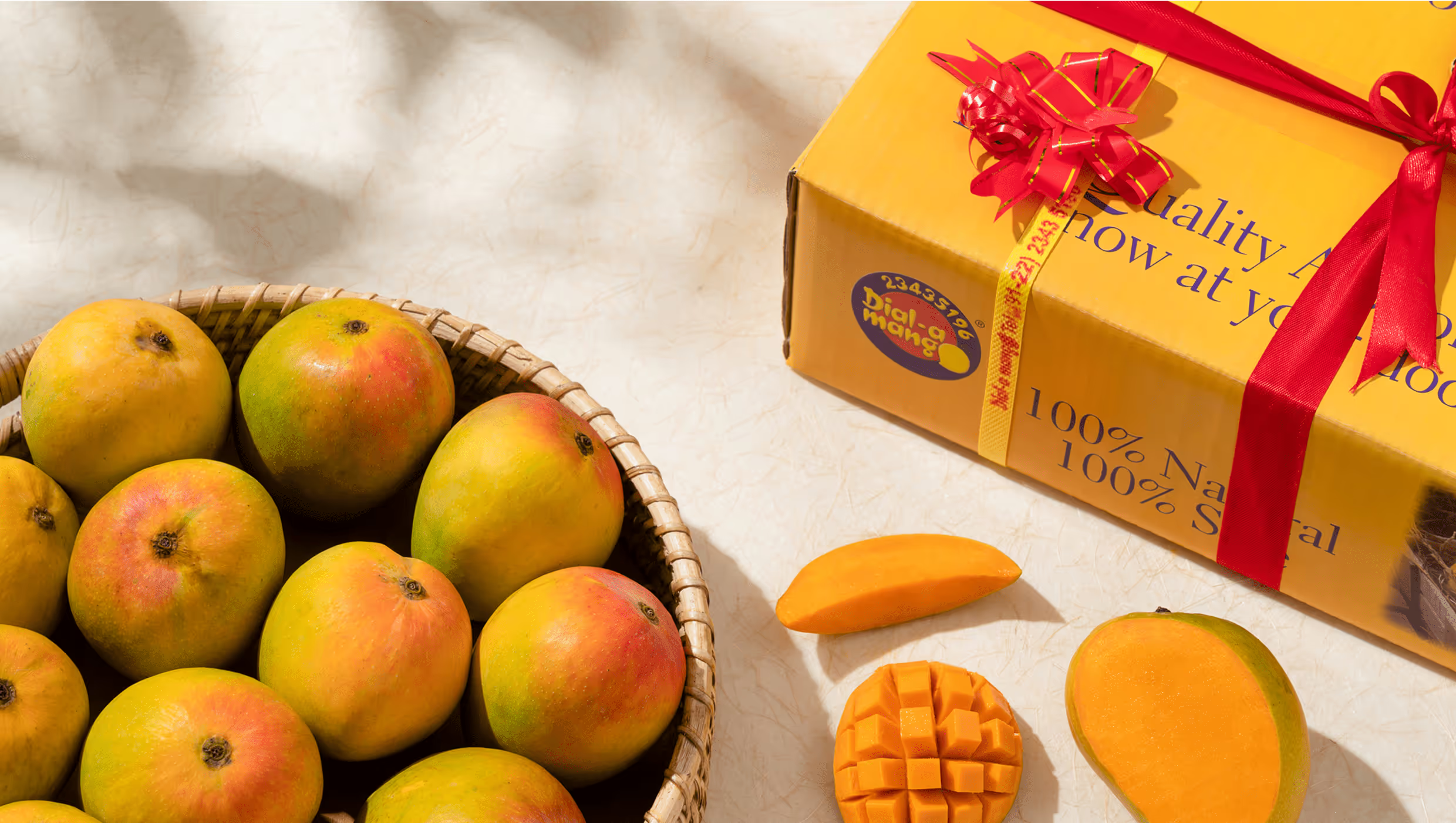
Dial-a-Mango is a heritage mango brand rooted in Maharashtra’s Konkan coast, with a farming legacy dating back to 1954. Unlike generic vendors flooding the online space, Dial-a-Mango grows and exports GI-certified, chemical-free Alphonso, Kesar, and Pairi mangoes from its own farms in Devgad, Ratnagiri, and Raigad. With a meticulous 10-step post-harvest process and an APEDA-approved pack-house, it delivers naturally ripened, export-grade mangoes directly to Indian and international consumers.
But a mango is not just a product—it’s a feeling. And Dial-a-Mango needed a digital space to reflect that.
The Challenge
India’s online fruit market is noisy, unregulated, and built on distrust. Fake Alphonsos, chemical ripening, and poor delivery experiences are the norm. Dial-a-Mango stood apart with its certified purity, 70-year legacy, and farm-to-doorstep integrity—but none of that was visible in a sea of standard e-commerce templates.
We needed to build a digital flagship that didn’t just sell mangoes but told a story of heritage, craft, and care. One that allowed users to almost taste the mango through their screens and feel justified in paying a premium for authenticity and traceability.
Our Approach
We approached the project like you’d approach mango season: slowly, thoughtfully, and with attention to natural cycles. Our goal was to redefine what a “fruit website” could feel like, taking it from transactional to experiential.
Through interviews, strategy sprints, UI exploration, and custom ecommerce development, we built a platform that positions Dial-a-Mango as a premium agricultural-luxury brand, not just an online fruit shop.
Discovery
Discovery Session
Competitive Analysis
Audience Definition
Strategy
User Experience
Wireframing
Content Writing
Design
Design Strategy
UI Design
Design System
Technology
Quality Assurance
Interactive Prototyping
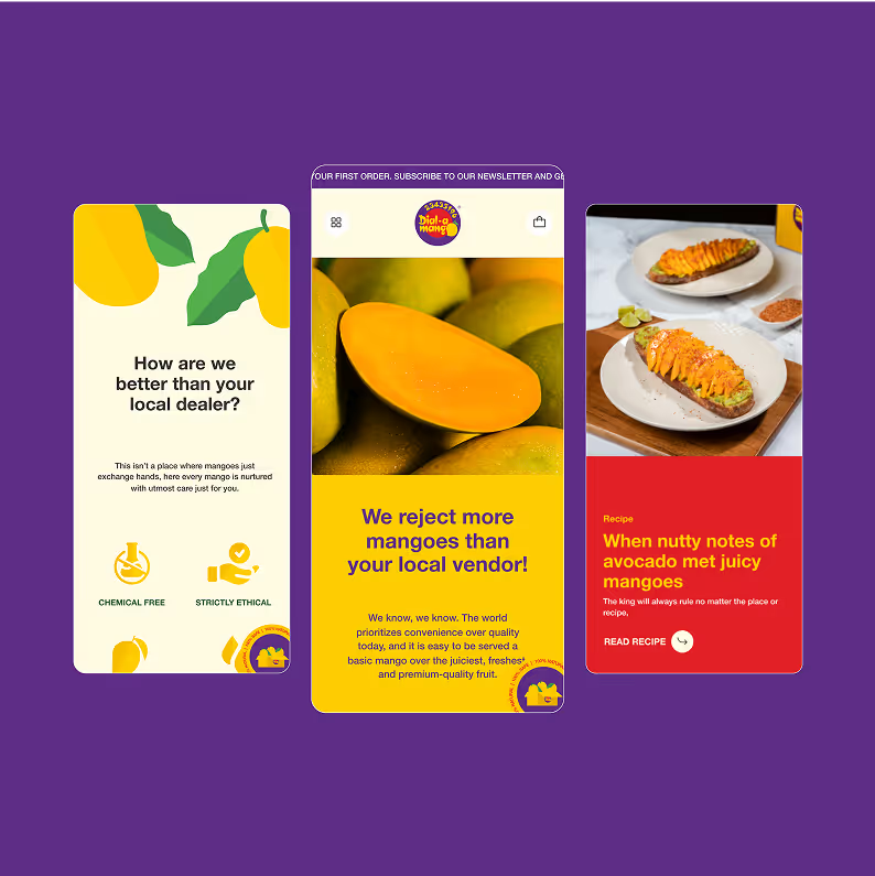
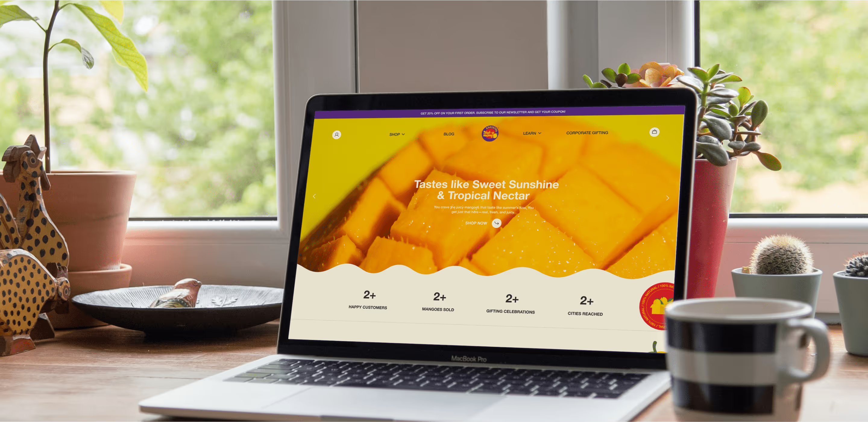
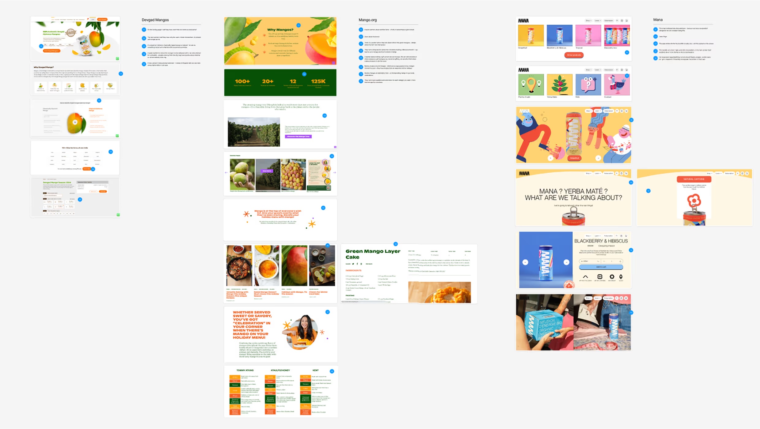
The site architecture for Dial-a-Mango was designed to mirror the user journey—from curiosity to conversion—while reinforcing the brand’s premium, process-driven ethos. The primary navigation was divided into clear, functional sections: Shop, where users could explore mango varieties by grade and type; Learn, which housed the brand story, farm-to-delivery process, and FAQs; and Blog, where culture and recipe content deepened engagement. Supporting pages like Corporate Gifting, Contact, and essential footer policies rounded out a clean, intuitive structure. The sitemap ensured that every visitor, whether a first-time buyer or returning customer, could confidently navigate the experience and find exactly what they needed—fast.
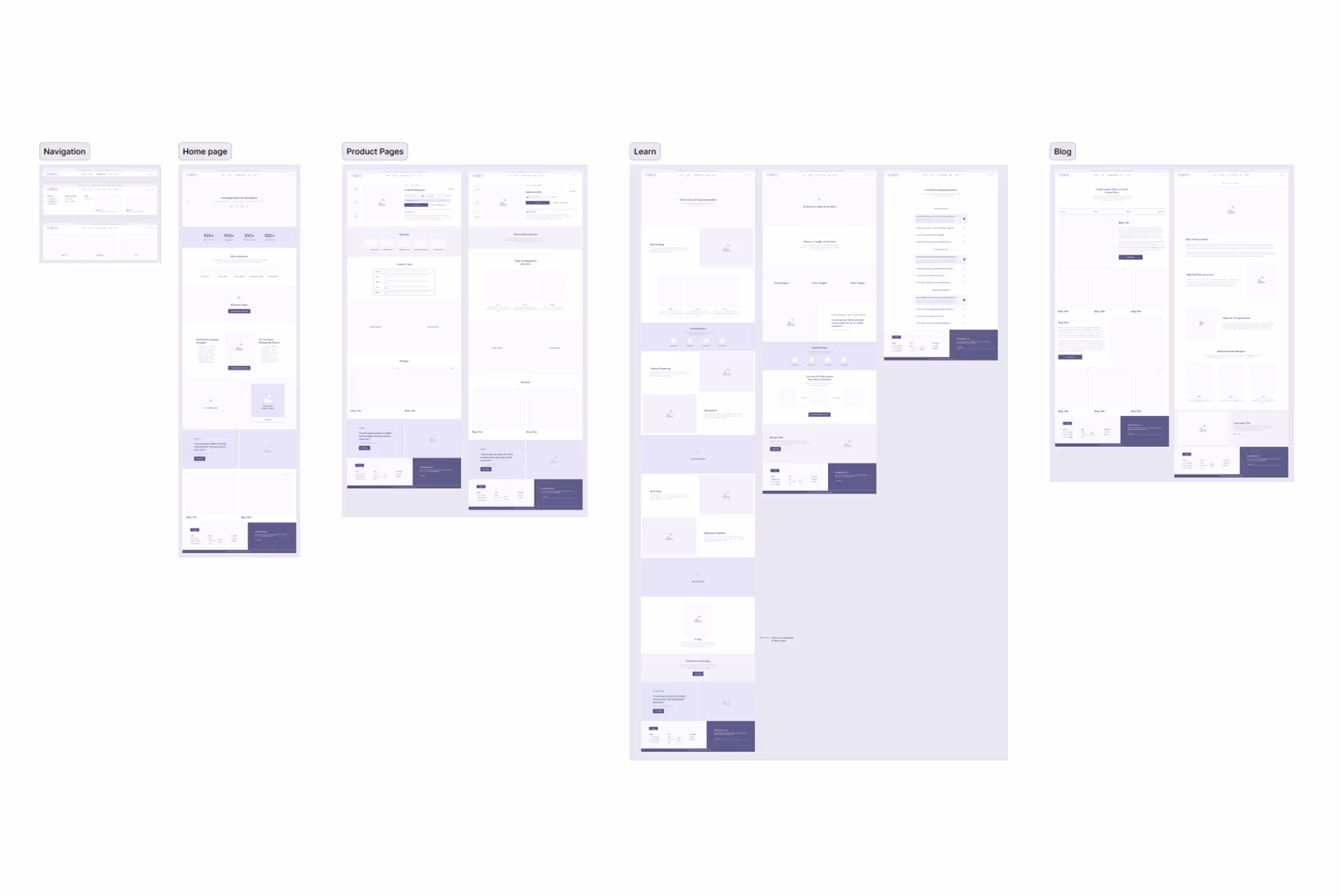
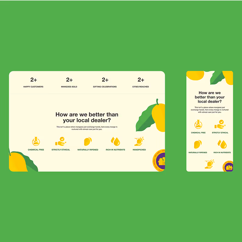
We structured the wireframes to balance editorial storytelling with frictionless commerce. The homepage opened with a lush, immersive hero section to establish mood, followed by modules for featured mangoes, the desapping process, and trust signals like GI tags and certifications. Product listing pages focused on visual clarity and filtering, while individual product pages offered large imagery, detailed variety info, and persuasive add-to-cart flows. Informational pages like “About Us” and “Our Process” were treated like mini editorials, while the blog and gifting pages were modular and content-rich. Each wireframe aimed to create a sensory, trustworthy buying experience—one that feels more like a seasonal ritual than a standard e-commerce transaction.
Brand naritive
Dial-a-Mango is a devotion to season, soil, and the patience it takes to grow something extraordinary. A return to ritual over routine, where mangoes are not just bought, but awaited. It’s a celebration of integrity over urgency—of fruit that carries the memory of place, care, and craft.
Audience
Dial-a-Mango is crafted for the mindful mango lover—someone who values quality over convenience. They see mangoes not as routine groceries, but as seasonal rituals tied to memory, place, and craft. This audience is: Legacy-aware and quality-driven: They care about where their food comes from, value GI certifications, and trust brands rooted in heritage and transparency. Gifting-led but emotionally invested: Whether buying for loved ones or clients, they seek thoughtful, premium experiences that feel personal. Health-conscious yet indulgent: They want fruit that’s pure, chemical-free, and naturally ripened—but never compromise on taste or richness.
UI Design
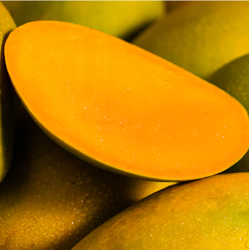
We built the brand experience around the joy of mango season slow, sensory, and worth the wait. The site doesn’t rush the user; it welcomes them in with fun, warmth, and a grounded familiarity. Rich photography, sun-soaked tones, and soft transitions create an almost tactile experience, letting users feel the fruit before it arrives. Every scroll is less about selling and more about savoring turning a functional purchase into a delightful seasonal ritual.
We built a custom icon system that aligns seamlessly with the brand’s warm and sensory visual language. Using a monochromatic, two-tone effect, the icons create subtle depth and texture while maintaining simplicity and elegance.
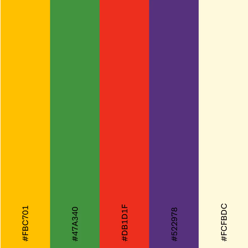
Deep saffron, turmeric yellows, earthy greens, and sun-warmed browns form a palette that’s natural yet elevated. These aren’t stock “fruit colors”—they’re rooted in farm soil, mango skin, and canopy shade, helping reinforce authenticity and grounding the luxury tone.
The brand’s entire digital expression is built around slowness, ritual, and anticipation—mimicking how one actually experiences mango season. The tone is emotive, warm, and heritage-driven, making each scroll feel like peeling back a mango layer rather than swiping through a product catalog.
-min.avif)
Bringing the Farm to the Forefront
The brand’s About page and storytelling bring the farm—not just the fruit—into focus. By highlighting its 70-year legacy, deep Konkan roots, and the people behind the produce, Dial-a-Mango humanizes the digital experience. Visitors don’t just see a product; they see the soil it came from, the faces who nurtured it, and the heritage that shaped it. This connection to origin fosters trust and reinforces that the brand’s promise isn’t just marketing—it’s personal.
Dial-a-Mango proves its premium quality through clear third-party certifications like GI-tag, APEDA approval, and Jaivik Bharat. These credentials are prominently featured throughout the site, assuring customers of authentic, export-grade, and chemical-free mangoes—setting the brand apart from unverified vendors.
We used stats to build quick, visual credibility—showcasing scale, legacy, and quality in a way that’s easy to trust.
A Transparent 9-Step Post-Harvest Process
Trust is also built through radical transparency. Instead of vague claims, the site walks users through a 9-step, chemical-free post-harvest process—from harvesting and desapping to natural ripening and sorting. Each stage is explained clearly, helping customers understand what sets Dial-a-Mango apart from mass-market alternatives. This level of openness not only reassures buyers of quality and hygiene but also justifies the premium pricing through process integrity and care.
The date picker feature lets users choose their preferred delivery date, giving them full control over when their order arrives. This ensures mangoes reach customers at peak freshness, enhancing trust and convenience while reflecting the brand’s commitment to a premium, personalized experience.