Loope is a fresh, fun sub-brand by Crossword - created to be the go-to destination for gifting and stationery. While Crossword is loved as a bookstore, Loope builds a world dedicated to thoughtful gifts and playful finds. It’s the place you return to again and again, always discovering something new and always leaving a little brighter.
The objective was to build an identity that feels approachable, energetic, and universally appealing. The name of the brand needed to be memorable and easy to recall, yet flexible enough to stretch across multiple categories - from notebooks and cards to games and gifting sets. That’s where Loope found its meaning, becoming a name that naturally loops into everything it offers: simple, joyful, everyday essentials designed to spark fun.
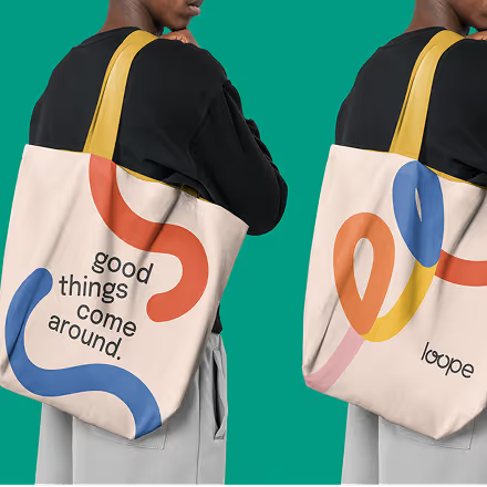
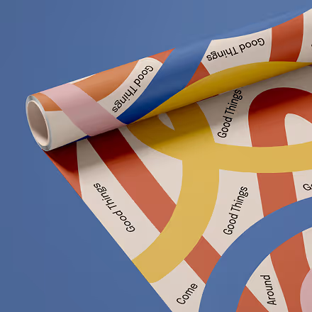
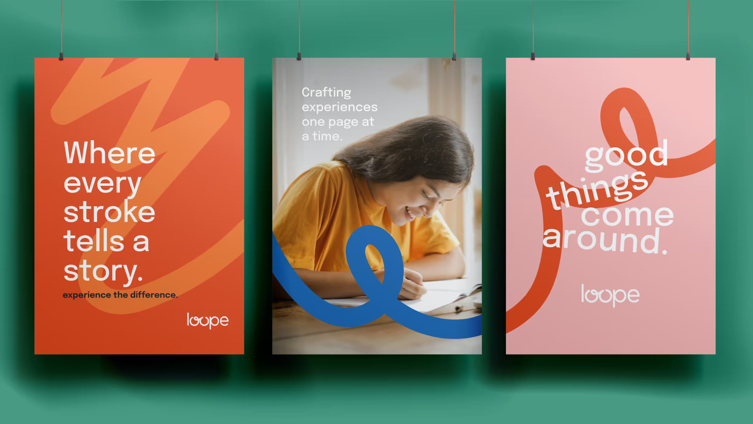
The brand idea led to the tagline “Good things come around,” capturing both the promise of always finding delightful products at Loope and the behaviour of returning to the brand again and again. Every element - from naming to positioning - reinforces the idea of a place where good things are discovered, shared, and revisited.
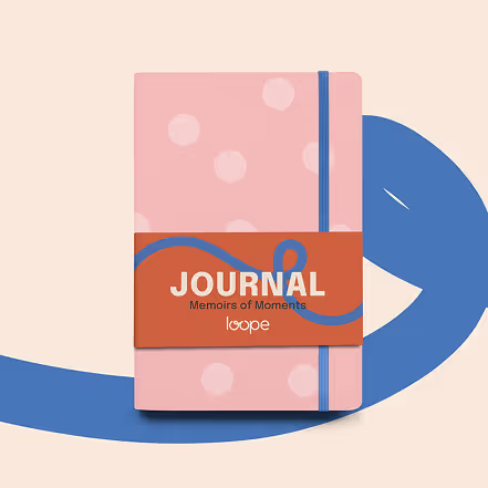
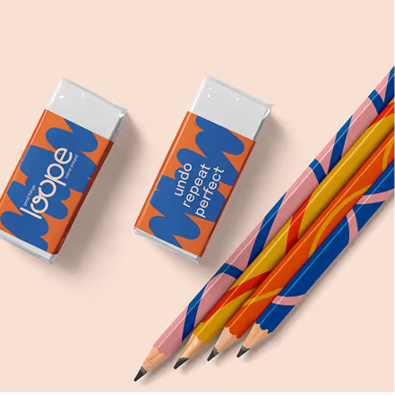
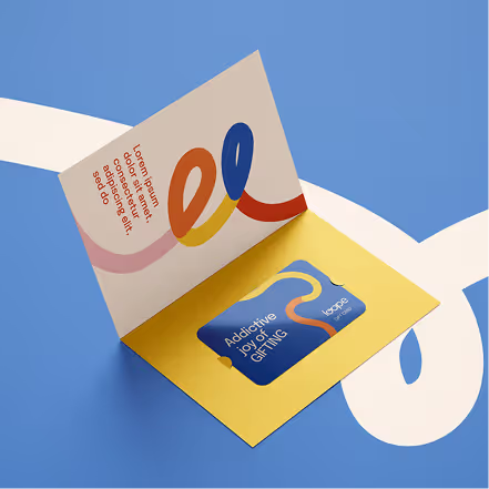
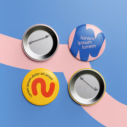
A bright, youthful palette brings energy and warmth to the brand. The colours work together across all applications, making Loope feel lively and instantly recognisable.
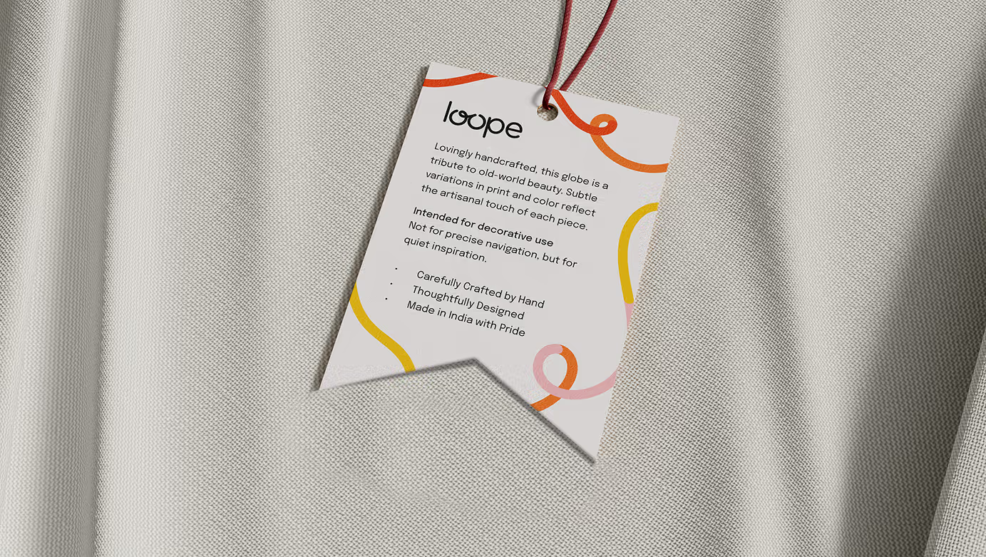
Free-flowing loop strokes form the core visual element - adaptable shapes that add motion, personality, and a sense of fun across different media.
The identity translates seamlessly to packaging, stationery, posters, games, and digital use. Each application carries the same playful spirit while staying distinct.
