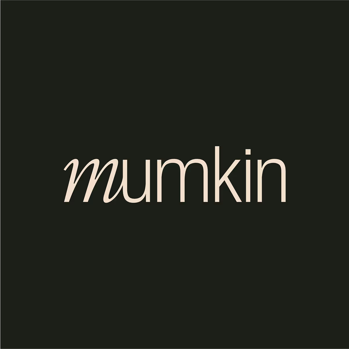
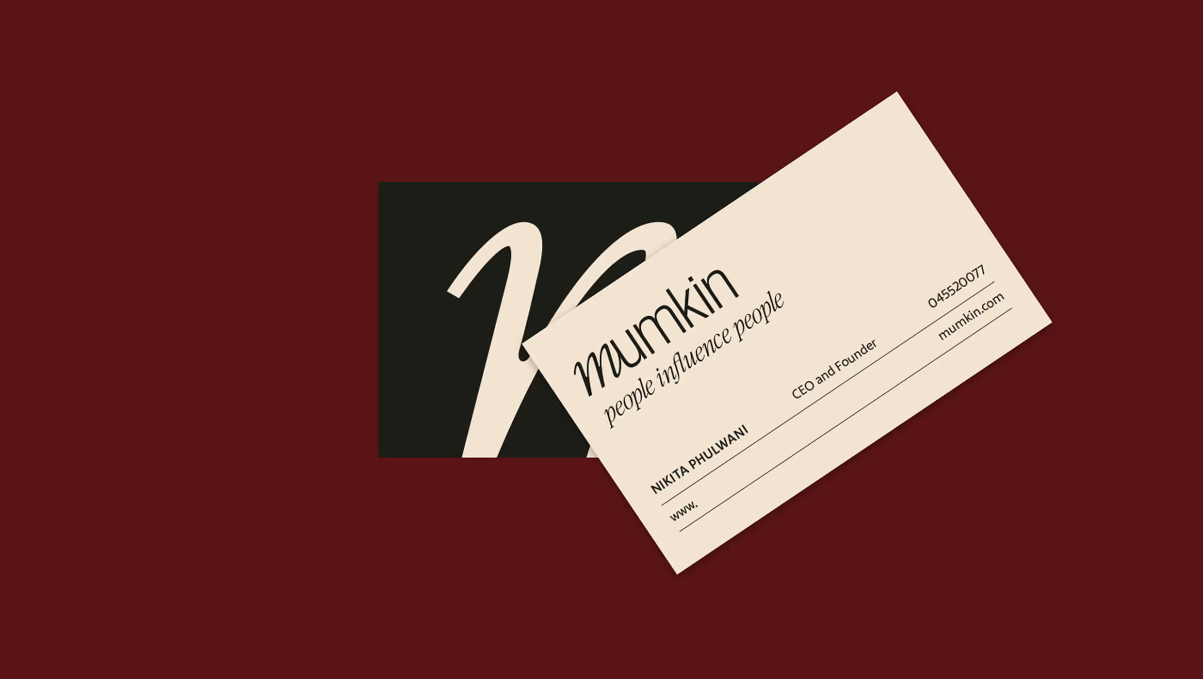
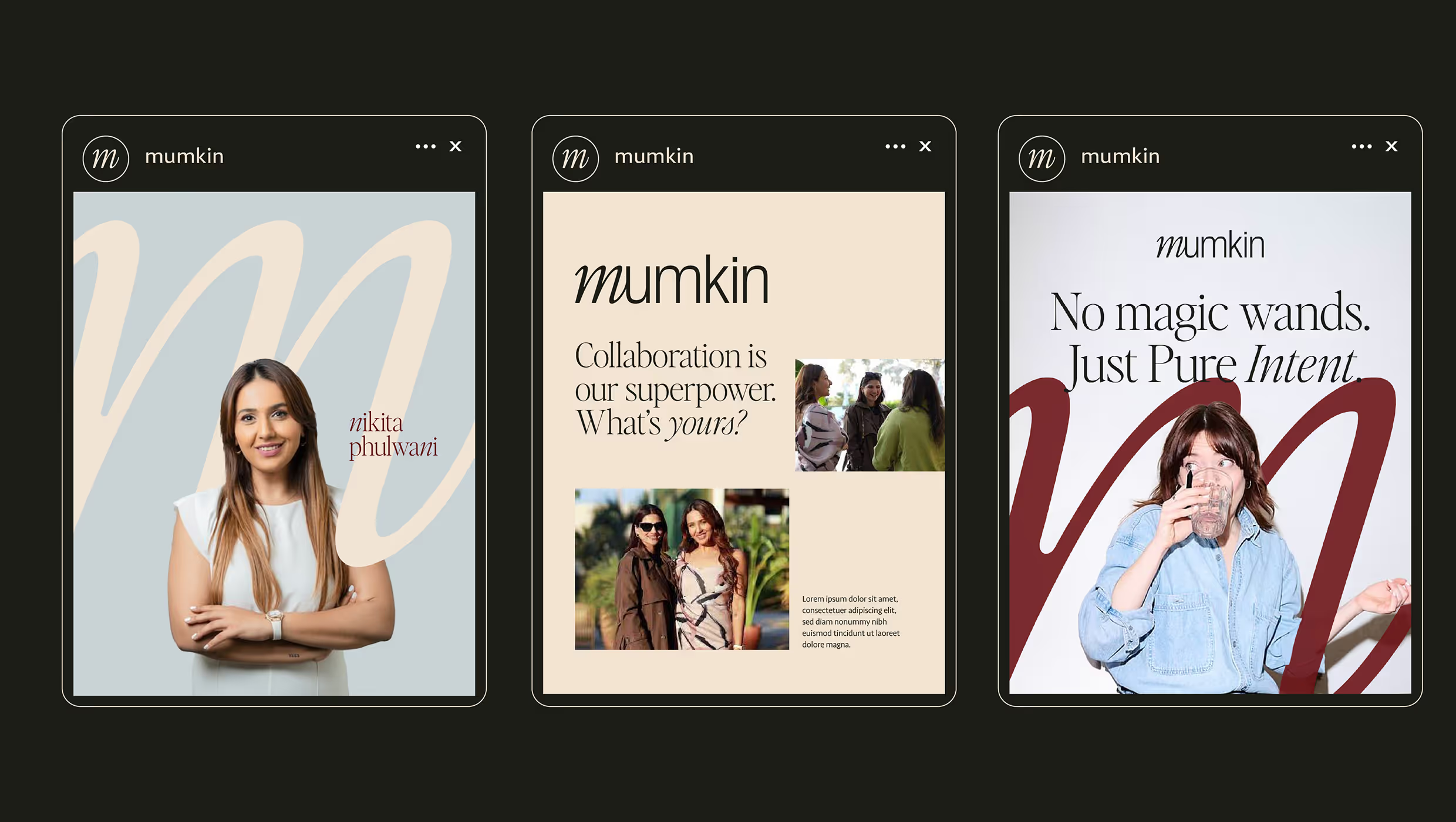
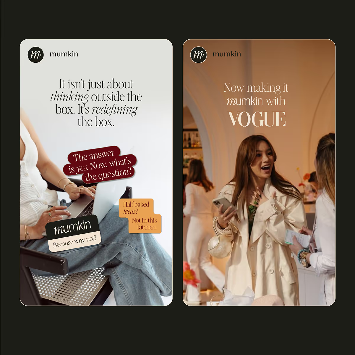
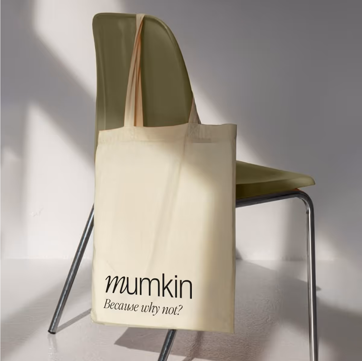
The logo blends a fluid script ‘m’ with a sharp, sans-serif typeface, a deliberate contrast designed to reflect the brand’s balance of flexibility and precision.
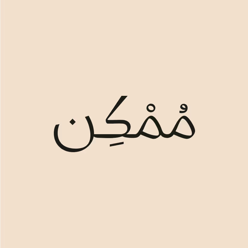
We used Arabic script to reflect the brand’s cultural roots in the UAE and to highlight its deep connection to the region’s identity.
The notebook featured a note from the founder and motivating page breakers to encourage reflection and writing.
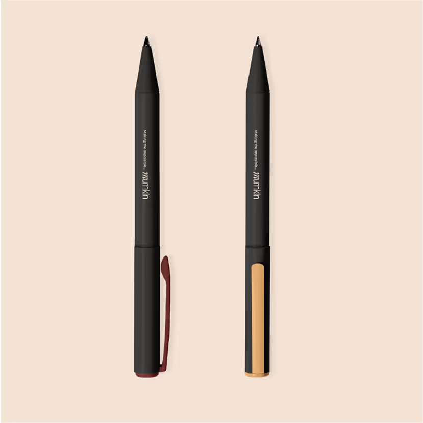
A minimal pen designed to write your own possibility created to pair seamlessly with the notebook and complete the experience.
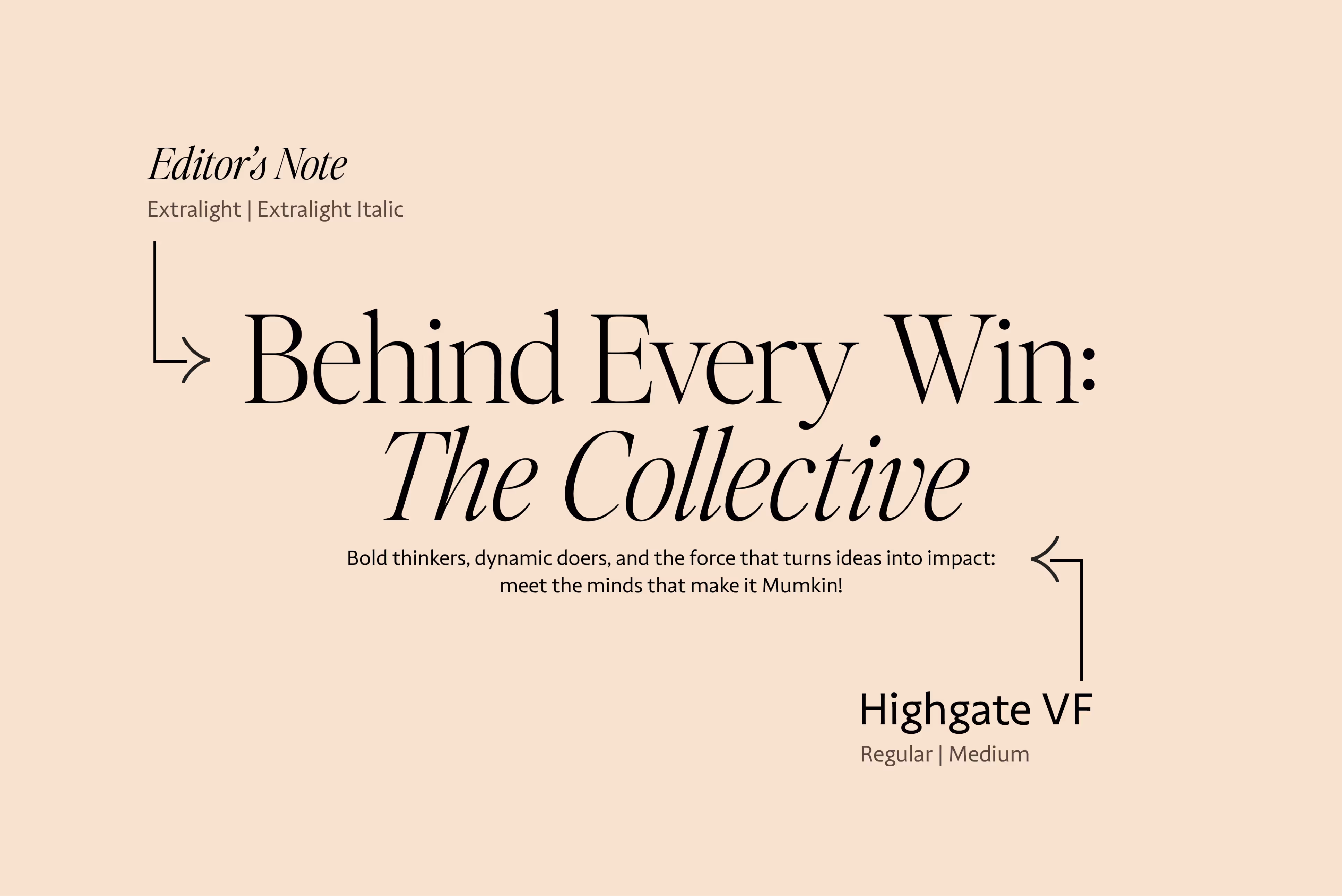
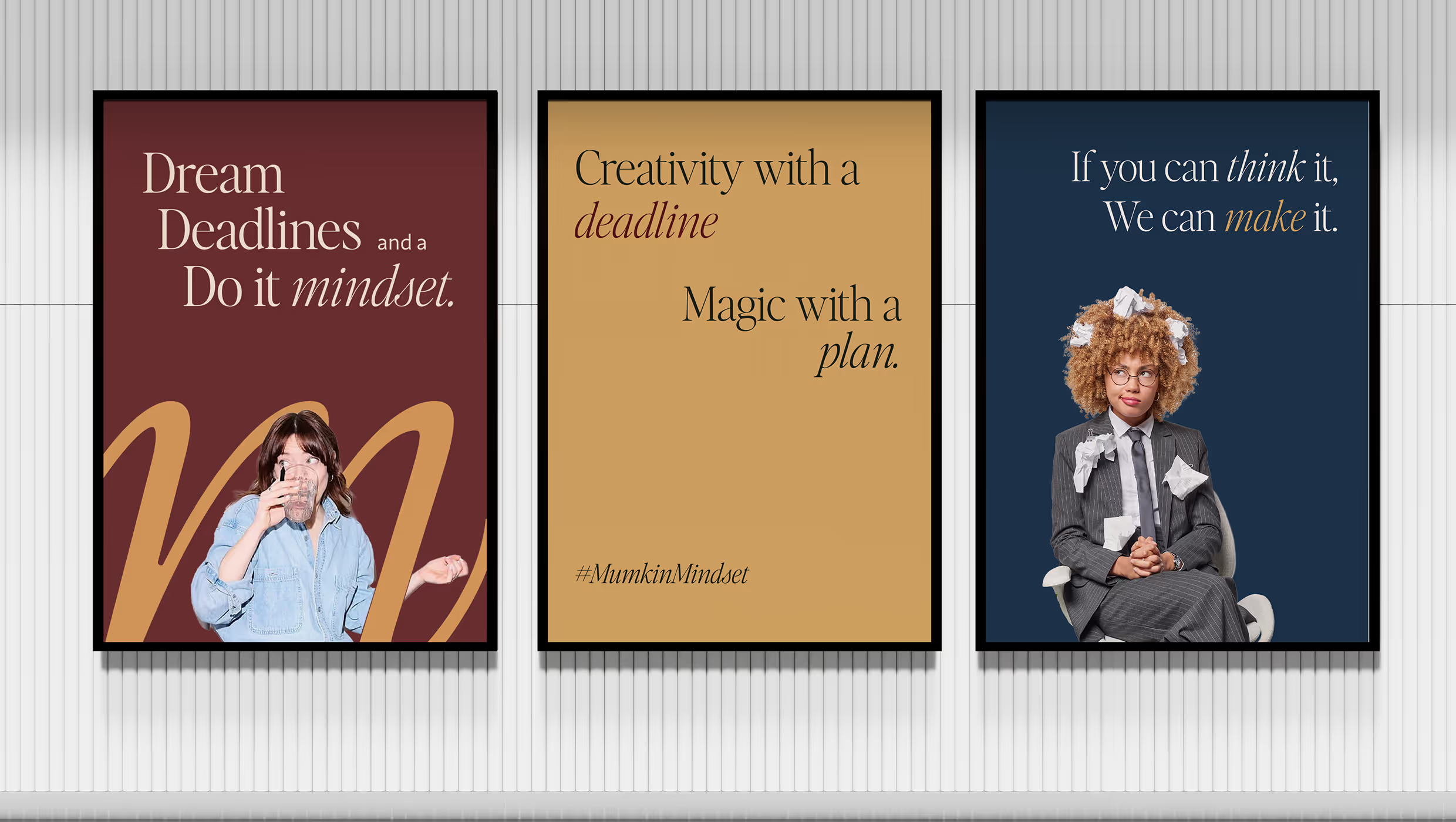
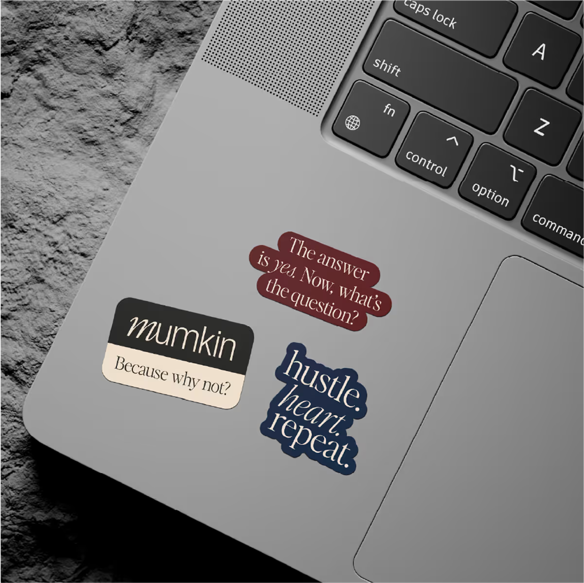
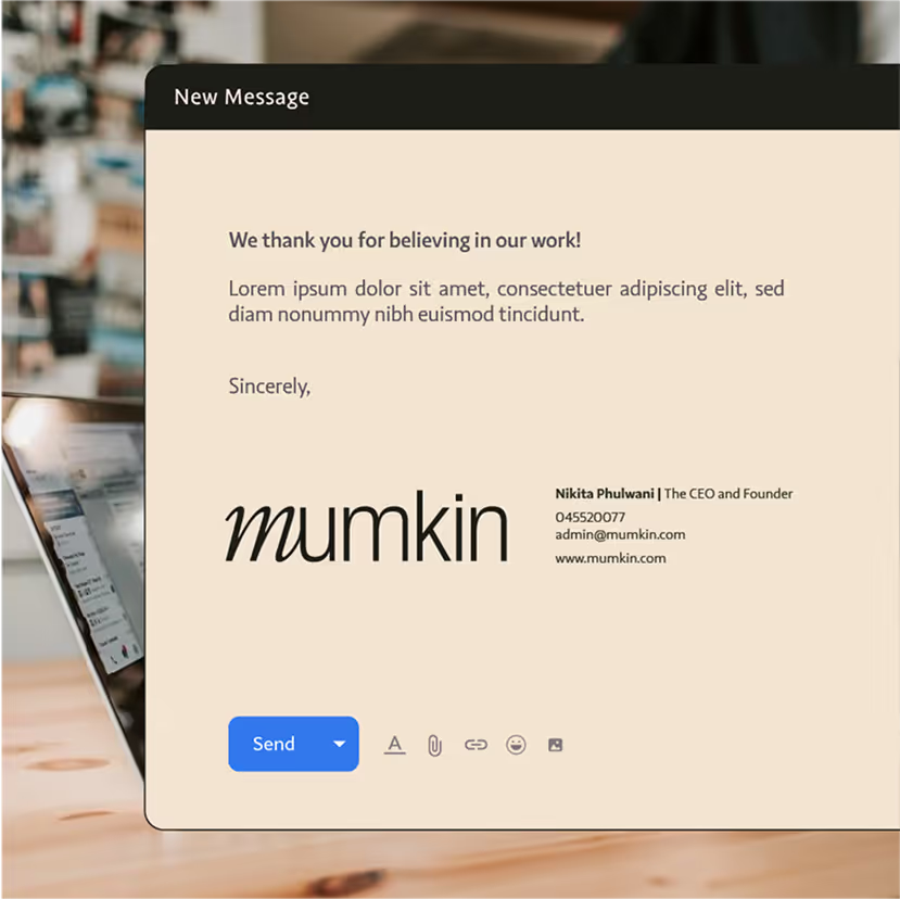
The headline font is a classic serif that's elegant, sincere and timeless. It adds personality without being too bold. The body typeface is clean and versatile. It works well across formats and keeps things easy to read.
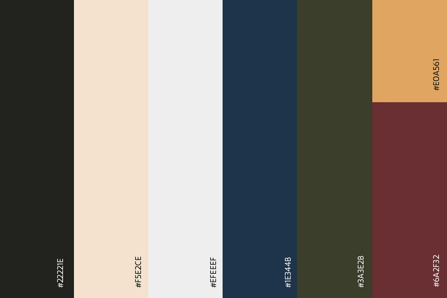
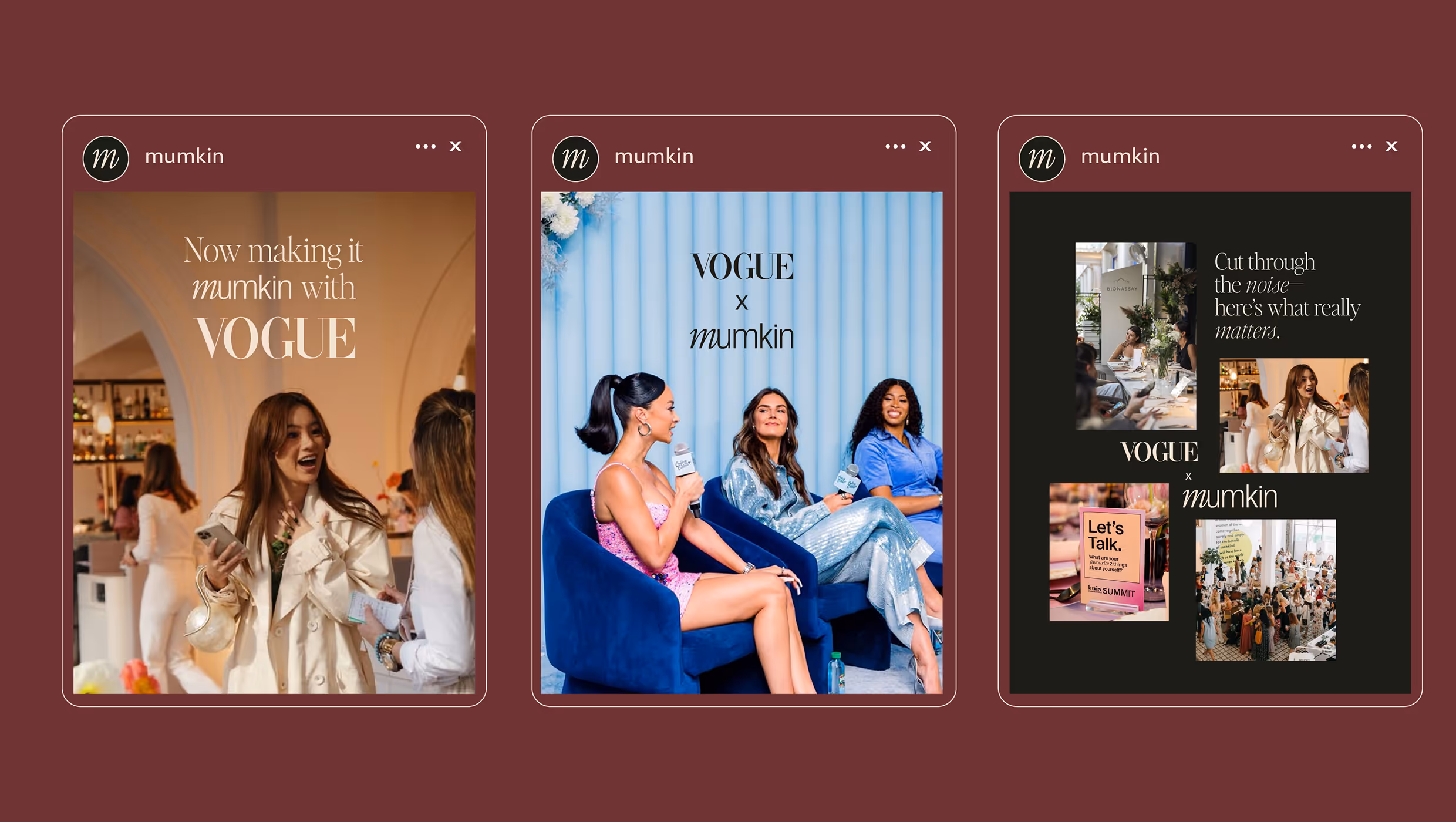
The palette uses vibrant colours in a muted way that are warm and welcoming, without being loud or flashy.
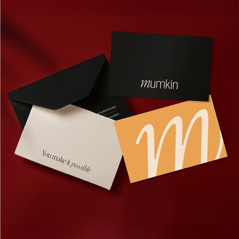
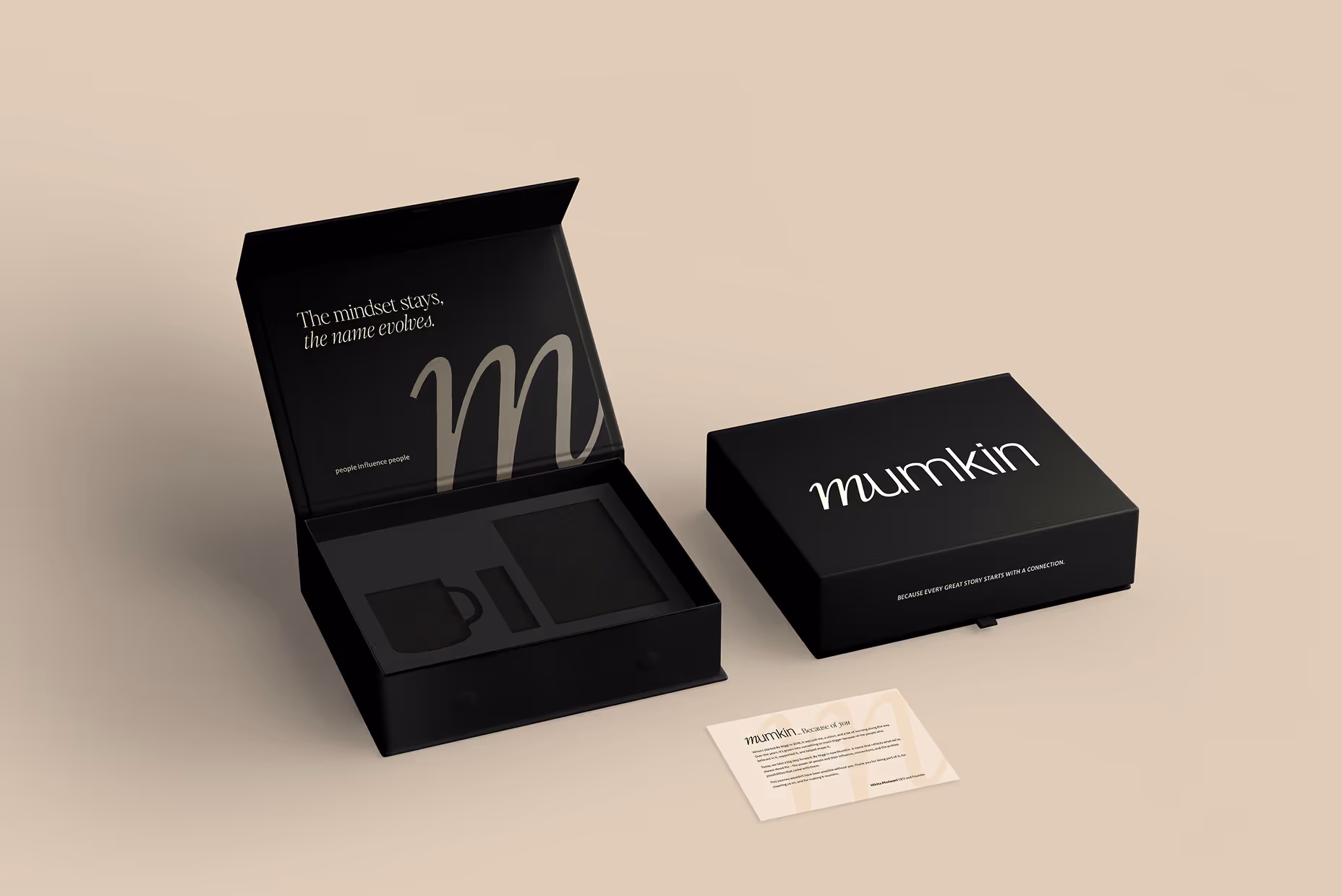
The PR box was designed to feel wholesome yet minimal, with a magnetic flap for a smooth unboxing experience. It marked the rebrand with thoughtfully curated essentials inside.
